
Mobile SEO Checklist for 2025: The Ultimate Guide
By: Jesse Medrano
2/6/2025
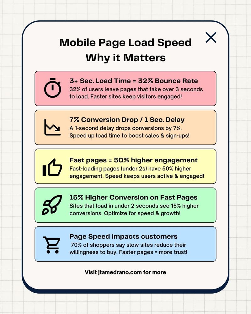
Slow load times kill conversions! A 1-second delay drops conversions by 7%, while pages that load in under 2 seconds see 15% higher conversions and 50% more engagement. Optimize your mobile speed to boost rankings, trust, and sales!
Mobile SEO Checklist for 2025: The Ultimate Guide
Why Mobile Optimization Matters for Google Rankings
Mobile SEO is a crucial task when it comes to getting your page to rank in the search engine algorithm. In the realm of web design, there are many interfaces we must consider when crafting the ideal experience for a user. Their journey through a website should be seamless when the intention is for the user to fill in your acquisition form, click your call-to-action (CTA), or enter their card information. By creating web designs with mobile users in mind, ideally first, the security of trusting your site to convert visitors to clients is increased along with revenue when this is done correctly.
Mobile First Design Tips for Faster Load Times
When users reach your website from their phone, the hosting platform sends data to render the page. This data can include HTML, CSS, JavaScript files, media, and more. All this data must be processed on the browser before the page is loaded and objects such as website scripts and large media take time to load onto the page. Depending on how your webpage is designed to load this data, the webpage will take time to display. Here are four things to look for when auditing mobile loading speed and how it can affect your website.
Page Load Time
Pages that take more than 3 seconds to load have over 30% increased probability that the user will leave. With odds stacked against your website in the growing digital landscape, this means websites with low click through rates will lose one in three customers to low performing mobile websites. By reducing the amount of long running scripts and size of media files, the page load time should decrease and make the page quicker for search engines and your customers to interact with. The faster the load time the better and targeting a load time below two seconds is the best way to grow conversion from visitor to customer.
Image sizes and formats
One of the bigger enemies to page loading speed is the size and file time of images that need to render on the page. Desktop browsers have an easier time loading various image files, but mobile browsers running on mobile networks can struggle to load large image sizes.
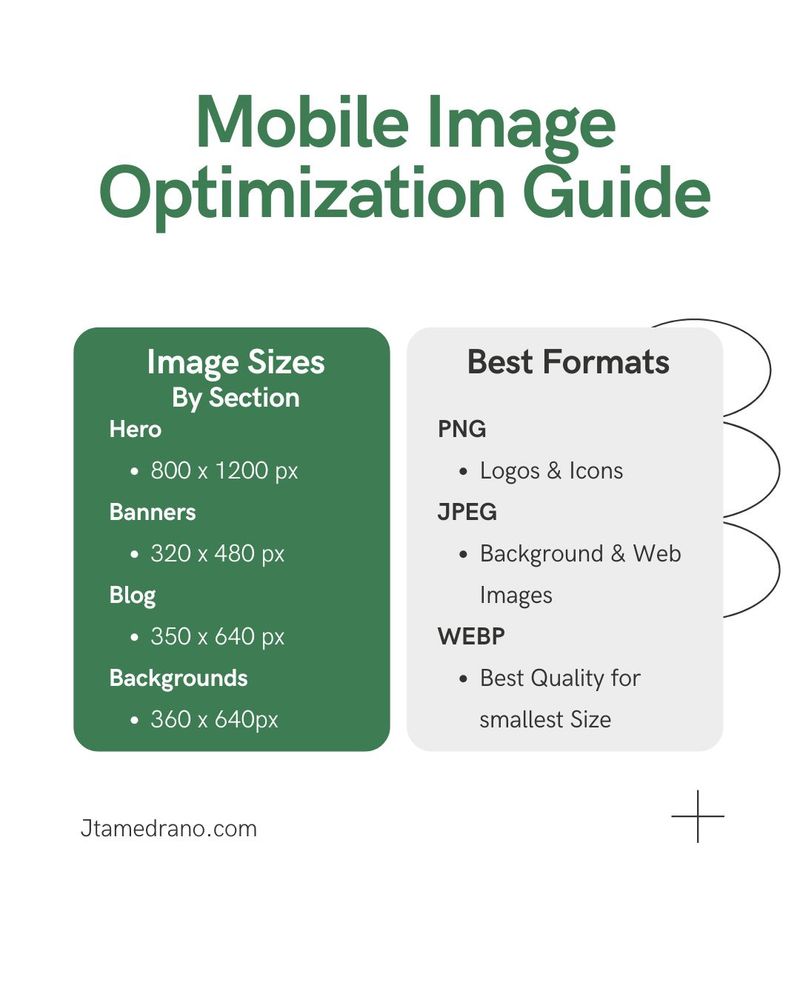
Here are some of the ideal max image sizes for various sections of your website:
- Hero Sections: 800 x 1200 pixels
- Banners: 320 x 480, 300 x 250, or 320 x 50 pixels
- Blogs: 350 x 640 pixels
- Backgrounds: 360 x 640
Here are some of the recommended image formats for your website:
- logos & icons: PNGs for images requiring transparent backgrounds.
- backgrounds & images: JPEGmini & JPG, (target an image quality between 75 to 85 dpi as most consumer grade screens won't render above this)
By maintaining image sizes and uploading with the recommended formats, page load times should not be impacted and when lazy loaded images will render faster on the image.
Minified CSS/JS
When the browser receives the files to render a webpage, the larger the JavaScript and stylesheets a website must process, the more time is needed to render web pages in most cases. Minification is the process where unnecessary whitespace, code syntax, and imports are reduced to allow the web browser to parse the files faster. Ideally, the less code to process, the better. Practices such as code splitting and tree shaking help bundlers such as webpack aid in the minification process. Taking advantage of server-side rendering is also beneficial as it builds most of the page with html, so the web browser gets easiest format for web browsers to display.
Browser Caching
Most web browsers can store temporary website data when an initial page load is rendered. Web page assets such as images, CSS, scripts, and fonts load and are stored during the user session, reducing the amount of server requests to display web pages. This also reduces the amount of bandwidth needed to render the page, enabling users with slower internet connections or limited data plans to enjoy your web page.
Mobile First Design Tips for Responsiveness Web Design
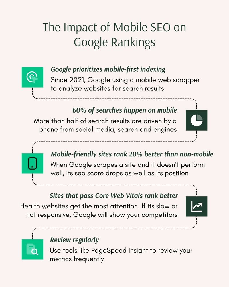
Going to a web page that was designed for only desktop experience leaves mobile users with poor user experience. Things like font sizes, scroll behaviors, and user control elements render and behave differently on mobile because of the size of the screen and the method of interaction. Since mobile users can account for more than 60% of web traffic to a website, it’s crucial to approach web design and development with a mobile first approach.
Viewport configuration
By setting your web page to render appropriately for various devices like e-readers, phones, tablets, and monitors of different sizes, preferably in that order, web pages will display correctly and give users a good start interacting with your web page. If a user is struggling to interact with your web page, the likelihood of bouncing off the website dramatically increases by over 60%. Combine that with a slow rendering website and you have lost all your web traffic. Here is a comparison of the various devices and things to consider:
- E-readers: Focus on accessibility for customers needing assistance; Search engines not only scrape html files, but text that is hidden from the browser gets ignored as well.
- Phones: Mobile devices account for more than 60% of web traffic from search engines and direct social media. Make it easy for customers to convert on your website.
- Tables: Probably the most forgotten media query as most designers consider desktop and mobile devices only. Going with a mobile design first is the safest for this kind of device but consider these are the devices that are used in different layouts from horizontal to vertical. Make sure your webpage can respond to size changes effectively for these cases.
- Desktop: Every monitor is different from notebooks to laptops to ultra-wide experiences. For businesses, it’s best to go conservative and use standard laptop sizes as the max width. For more creative industries such as artists, game studios, and storytelling, accounting for wider devices can also be beneficial, but not a requirement.
Touch Element Spacing
Compare the size of your cursor on a desktop to your thumb. If a user-controlled element is too small or the button only responds when the text is clicked, regardless of the size of the container, users will struggle to add items to their carts, fill a contact form, or press the Call-To-Action (CTA) button. Here are tips and tricks designers use to make it easier for users to interact with elements on mobile devices.
Buttons and Inputs on web apps and pages do well when the button takes up at least 80% of the available space. It’s also recommended to increase the height of a button to at least the width of a thumb. Assess these features on your phone and assume the user has their hand in various positions. They should be able to tap elements with ease. Important Note: clicking on an input field will raise a keyboard and if the element gets blocked by the keyboard for any reason, then the user won’t be able to see what they are typing.
Navigation menus are best placed within a container that can be displayed when a button is pressed. The infamous hamburger menu, described by three horizontal lines stacked on top of one another with a bit of space, is the best choice for a button as its an industry standard, making it easy for users to infer there is more content to see. Displaying a full menu of options, especially more than four horizontally, can hinder usage. If this is absolutely needed, make the menu scrollable.
Spacing between the various elements is crucial to making sure users get the intended experience. The last thing your business needs is a user clicking on the cancel button after spending their time going through a lead generation form. Making sure there is ample margin between buttons, inputs, sliders, and other elements ensures the user doesn’t let their thumb spread and affect other interactive elements.
Font Size
When working with font size in mobile display, it’s easy to forget something as simple as setting it to default to an easy-to-read size like 16px. Don’t force your user to zoom in because it’s likely they won’t bother and will press the back button faster than it takes for your splash page to grab their attention. Text in hero sections may also need to get adjusted if they were set to a much larger size for desktop. Text cutting off sides of the page could potentially push other elements off the screen, force elements to shrink in size, or even narrow the whole page to display, making the site virtually unusable. By using responsive units such as EM’s, REM’s, VW and VH will allow for text to scale properly. If you are unfamiliar with these units, let a trusted professional such as J Medrano Design use these properly for your website.
Horizontal Scrolling
Many designers/developers implement what is called “Scroll Hijacking”, where the user’s normal vertical scroll is taken over and force the page to scroll horizontally. This is a vastly different concept to horizontal grid layouts where a section of a page has an overflow of information that can be viewed with a swipe or scroll on hover. In cases where Scroll Hijacking is implemented, the user has no choice but to accept the developer’s implementation and can cause confusing behaviors for users. This is more prevalent in mobile design where the user is already limited to navigating the page in a slimmed down version of a web page. Web browsers naturally look for vertical scroll behavior making horizontal scrolling unintuitive. Image the user having to scroll up and down for the page to move left and right. It may be unique, but when users are looking to purchase a product or hire you for your services, the more time they must process what is going on in the moment is another second they are delayed from converting and potentially get turned away.
That’s not to say there isn’t a use case for this, creative industries like gaming studios, artists, and musicians might intentionally want to break the barrier from design and take the user through immersive experience. In the case of a website intended to get users to fill in your form or enter their card information as quickly as possible, the more discovery a user must do before making the commitment typically has a negative ROI.
Conclusion
Mobile design is crafted in its own and requires time testing on many devices to ensure the quality is met with the standard of the user. It is quite common for a designer to an opiniated design. When customer experience is not considered in the design process, it’s easy to miss out on converting visitors to customers.
Ask how you can get a free hero section redesign!
Get Your Free Consultation